Monday, 16 March 2015

Finn Week 8 and 9: The Prince

As the Prince was the protagonist from the story we felt it would be important to spend a second week on designing him. This would allow us to produce the two versions of him in the story. The first, is when he lives in the safety of the castle and the second is after Iron John has taken him into the forest.
We set up our Pinterest board and gathered as much reference as we possibly could.
I felt he had to be opposite to the King in his stance and general design. The King has almost a downward feeling. His horns curve downwards, he has a weight on his shoulders, he is slightly hunched over, his facial expression is somewhat negative and a majority of what he wears has downward vertical lines. I tried to give the impression that he is closed off from the world around him.
For the Prince, I tried to reverse this. His horns should curve upwards and his posture should have more of a curve to it.

Royalty is a big part of the story so I thought the use of crowns and intricate head pieces would be a good way of having some consistency in my designs. For the Prince, I wanted it to develop as he does throughout the story.


One big challenge for me I realised as soon as I started this task was that drawing children is extremely hard to do! Their facial proportions are quite different from that of an adults. This proved to be a great learning experience. Below are some sketches as well as some head studies where I played with hair styles.


With a general idea of what I had in mind I got to work on some clothing iterations. I tried looking at what makes an iconic video game character. Link from the Legend of Zelda and Ico from Shaow of the Colossus stood out to me the most. Their design is simple and their silouhettes are instantly recognizable. I figured to much noise would kill my design. Elements of the King had to show as well such as fur, clothing colour and the crown.

After establishing the young Prince I tried pushing the silhouette for the older Prince. I wanted him to have a wild appearance after living with iron John in the forest for some time.
Parts of Iron John had to reflect in the second phase of the Prince's character development as well. I used things like colour, tribal elements and his staff to show the influence of what living with Iron John has on the Prince. In the story the prince's hair falls into a magic pool and turns his hair gold so I had to make sure this reflected in the design. After some silhouettes I could see they were becoming a bit too noisy and I would have to simplify them down.


 The progression of the Prince's head piece was going to be very important as well.


The big challenge for me here was upgrading the Prince's armour appearance with out adding too much detail. I also tried to add upward curving motif's in the character such as his crown, curved horns and his curved weapon.

During this 2 week period I also completed my second pass on the Huntsman. I made sure elements of my early sketches made it into the design. The big thing here was to make the design fit more within the world I had envisioned compared to my previous attempt. I like to think I've achieved this.


Tuesday, 3 March 2015

Karol Week 5 & 6: Iron John and Refinements

Week 5:

In week 5 we designed the eponymous character - Iron John.

In the story the huntsman finds Iron John hiding in the forest. He gathers more men and together they capture this gigantic wild man and then drag him to the castle where he's imprisoned. After some time spent in a cage on the courtyard he manages to trick a little prince into opening it and he escapes. However, seeing the boy scared to tears of what he has done and of possible consequences, Iron John takes him with back to the forest and he takes care of the boy.

Since I've read the story for the first time I've imagined Iron John as an emphatic gentle giant misunderstood and oppressed by people scared of his monstrous appearance. Even though some people have vanished in the forest where he have lived it's never said that he was responsible of those disappearances.

I started with some rough silhouettes, trying out different shapes and proportions. I didn't really have any presuppositions, just wanted to make sure that he appears big and hairy.  


After that I took my explorations further into the sketchbook. I focused mostly on different heads and faces ideas as I knew that I wanted the rest of him to be something between a bear and gorilla body.


I chose some heads that I liked and I attached some bodies to them. The bottom left one was a pretty good representation of what I had in mind so I chose that one for my final image:


Week 6:

In week 6 we decided to take a break from doing new designs and go back and polish some pieces from previous weeks. I made some minor changes to most of my finals, but there's only one big change worth mentioning - the King. As we go along creating new designs, the vision of the Iron John's world in my head gets clearer every week. It's going in a bit different way than I expected in the beginning of the project. Therefore, the king I created in the first week didn't really fit this vision anymore, so I decided to redesign and paint it again from scratch.


I still wanted to show the king as a warrior but time I put some more work into his armour and weapon design. I'm happy with how it turned out and I believe that this version fits the general idea of the world better. 


Karol Week 4: Wild Animals

For the week 4 we decided to design animals that could live in the forest. In the story they are mentioned only once, in the opening paragraph: 'Once upon a time there lived a King who had a great forest near his palace, full of all kinds of wild animals.' The creatures were clearly not important part of the story, however we decided to draw them anyway, just to challenge our creature design abilities. Beside, this broad description left a lot of creative freedom for our interpretations, so we simply couldn't resist.

I started the design process with some rough sketches. The forest that I came up with in the second week was a wet, swampy place, so from the very beginning I knew that I wanted my creature to be some kind of amphibian or reptile. I explored different head and body shapes and sizes.


After that I pushed some of those ideas further in Photoshop. In the sketches below I tried to merge together some real life reptiles with features of different types of animals.


The one that I felt that stood out was the rat-turtle kind of creature in the middle of the page. I decided to make some more variations on how that creature could look but ultimately I got back to the first one and I used this idea for my final image:


I could easily imagine this creature to inhabit the forest I designed the other week; using its sharp claws to climb the gigantic trees and it's beak to catch small mammals. 

Monday, 2 March 2015

Finn Week 7: The Castle

For week 7 we were to design the castle from the story. Architecture is very new to me and something I only briefly touched on with last years group project. When desigining it I knew it would make sense to design the castle around the king and his crown. I looked at old artists like Clarkson Stanfield and Albert Bierstadt and more modern environment concept artists like James Paick. Rather than just showcase the castle I wanted it to be set in an environment to help it fit the story.
Here are some silhouettes I did, designing with the King in mind.


It had to be slightly intimidating but also fit in just the right amount with its environment. I thought the feathers in the crown could be spires and that the castle should be on high ground, above but surrounded by the forest. I sketched up some rough thumb nails for composition. My favourite being the top right. These are really rough but it quickly conveys the ideas in my head onto paper.


Here I tried coming up ideas that covered certain design choices I had in mind such as having the castle on high ground, surrounded by forest and different kinds of spires.


I had an idea where the kingdom might look like Iron Town from the movie Princess Mononoke. What if the village was more industrial and used the surrounding forest for resources or if over time parts of the kingdom had fallen into ruin due to the forest.

Here is the final image I produced. This was a lot of fun to make even if the Photoshop file I was working on corrupted minutes before I had completed it! Luckily I managed to salvage most of it. I like to think the final image is a good example of taking a rough thumbnail sketch and turning it into a final image.


Finn Week 6: Refinements

For week 6, Karol and I decided to re-do or refine some of our older pieces from the project. For me I spent time attempting to re-do the forest piece, the Huntsman as well as tweaking the creature. The Huntsman is still a work in progress but I'm confident it will look much better than my previous attempt.

As mentioned I also felt I should re-do the forest piece. After some feedback I came to the realization that my pieces weren't fitting together or felt like they were in the same world. This is why we spent week 6 going over some of our older works.

I spent the start of the week on the creature. I created some line art orthographics and attempted to tweak the creature. The latter didn't work out as planned but I did create the ortho's.

As well as the creature, I also tweaked the King as I felt he needed to be in more of a standing pose. This would make the job of the modeller easier if this were used in the production of a game. I tried to get the idea across that the king is very closed off from the rest of the world and he possibly has a frail mental state as a result of being surrounded by the forest.


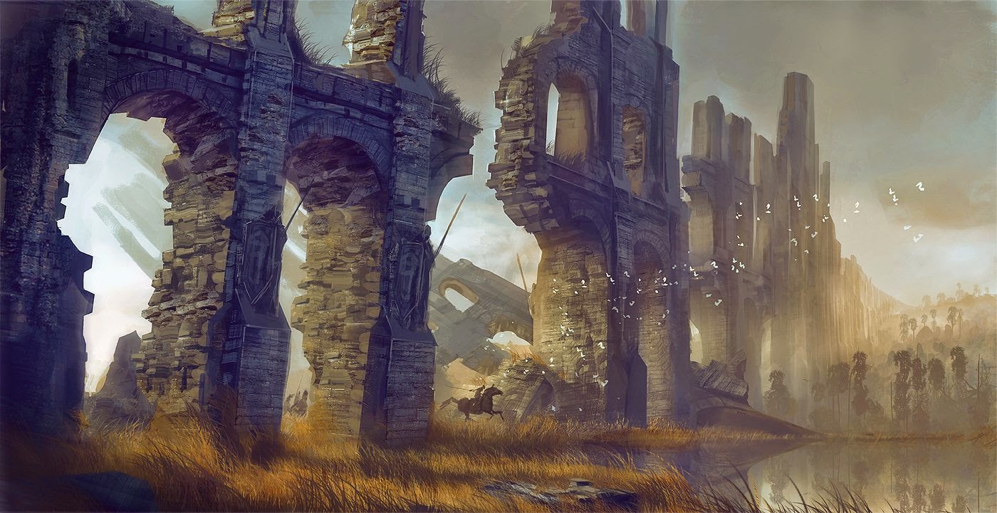
For the forest piece I was very inspired by a piece I accidentally came across while looking for reference online. I loved the depth and atmosphere that the artist created in the image and I wanted to attempt something similar. Something I noticed from my previous forest piece was that the trees needed to be broken up with possibly some old ruins. With that in mind I tried it in this piece.


 Here is a whitebox I used as a base for my image.

During the week I had a realization that a majority of pieces in my portfolio were blue or green or had blue or green in them. I made a point of trying to move away from that in this new piece.
I knew this image was going to be very challenging but I had fun making it all the same. To keep with the story I made sure to have a pool where Iron John might be dwelling. Overall I feel I could have done better but I did find it very challenging. If we get another chance of having a week to tweak certain images, I'll make sure to refine this a bit more.